It was a week ago when I realized my personal brand logo and online appearance are to dark for what I stand for and what I developed into. It was a “not happy with the old one” moment, which occurred few times in the past years at different moments and in different situations. I always feel the urge to develop further and I think that a personal logo should develop with one. So how did I got to develop a logo in the first place? And why did I need to develop it further? Well, let me start with the beginning.
The beginning – 2011
A few years ago I had this feeling that I need to have my own brand, so I started to brainstorm what I am, what defines me and how my brand could look like. One important part of the personal brand was to create a logo.
I started to play with some styles, typfaces and colors in Photoshop. Have to say that my Photoshop skills were limited. But something was clear, taking into consideration that my initials are RGB, that there is a color model called RGB (RedGreenBlue) which can be combined to get any color, that I am a person with many colors and versatile, it somehow needed to be connected to the color model. The first design wasn’t so cool, it was like a disaster in the SNAKE game on the old Nokias, if you remember. Or you could say it looked like a plumber logo, but not Super Mario Bros’, that one is cool.
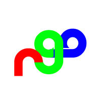
It was kind of crazy, somehow a bit too crazy. So I tried to find one central point to merge everything into one, and this came out.
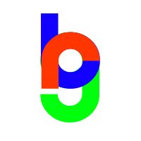
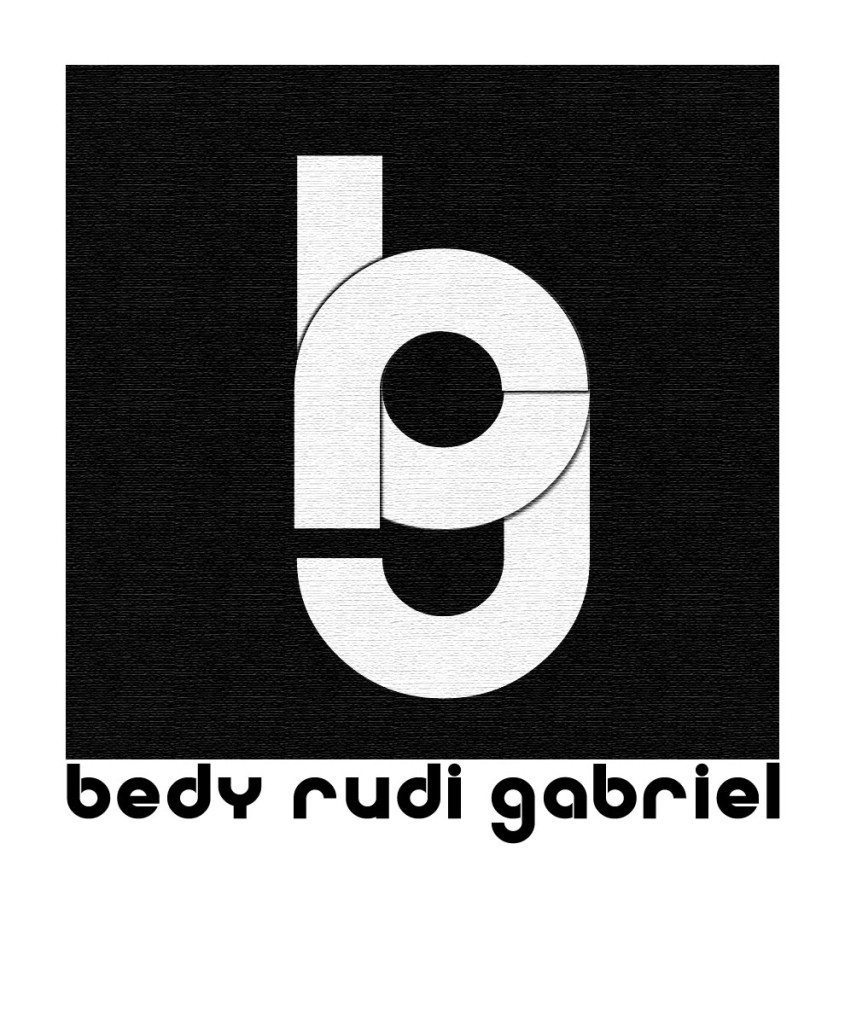
Now it was more compact, each letter had the respective color it should have but…..still looked like a 90′ logo. So the next step was to make it look more professional and a bit more modern, after all I work in Online Marketing with focus on Social Media. So the next step was to use the color in which all those colors mix into. Adding all those 3 primary colors together yields in White, and white looks great on black, and black is something serious and premium, right? Adding some “great” paper structure on it, and voilà.
There is a saying in Romania “You cannot shit into one’s taste”, meaning that everyone has his own taste for beauty and you shouldn’t tell him that what he likes is beautiful or not. But this doesn’t apply to my logo which is for the public.
It wasn’t cool enough, so I pimped it with some gradient from white to black, with the hope it will look great, actually more like awesome.
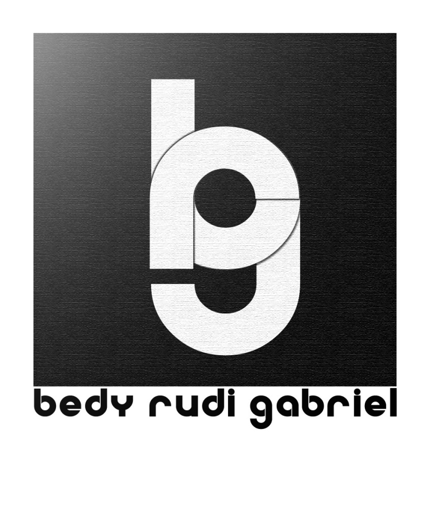
Pretty serious, has a kind of white-grey (not fifty shades) on a black background, some cool paper effect but…..wait! Using this texture on online platforms is a no-go because all platforms are compressing pictures making the picture look like sh*t. It didn’t really look ok on paper too and somehow reminds of a metallic brand sticker on a TV. So, now I needed to make a simple version of it, without any texture. The result was this.
And this was the logo I used for about 3 years, I was pretty proud of what I did there. It was my first logo, and it looked nice, had a good idea behind it.
The revision – 2014
I was looking critical once again on my website, and then I felt it, I was not happy anymore with the monotone logo and appearance of the blog. I was more, I was RGB with all the cool color mixes, not only the result of those 3. I needed to start working on it again, not making it from scratch, but developing further, like myself. Like a child grows so should my logo grow too.
So I started with having a rainbow of colors resulting from RedGreenBlue with many little RudiGabrielBedy logos inside it. Never thought I was going to show this in my life to anyone, but here it is….stop laughing.
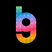
I know, I know, it’s more like a candy brand or a strange club. That’s why it didn’t make it to the public till now, it’s the logo’s first big public appearance so….stop laughing so hard. It’s sensible, it will cry.
But the idea of colors resulting from RGB and the small logos wasn’t so bad, because I wanted to show my multitude of skills. All it needed was to show it in another light, keep the basics intact and add the rainbow to it.
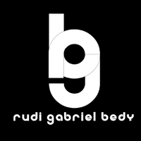
Cool, right? Keeps some tradition from the old logo and adds some modernity and versatility with the RGB rainbow. This is the one I used till now, and I really like it. But.
The second revision – 2016
So we are 2016, 2 years after the first revision, and my “not happy with the old one” feeling appeared again. I asked myself if black is the right way to communicate myself, to put in all the materials I have from Blog, CV, Presentation Templates, E-mail signatures to Business cards and so on. So I started to play with the logo again. No, I didn’t get a strange club logo again like in 2014.
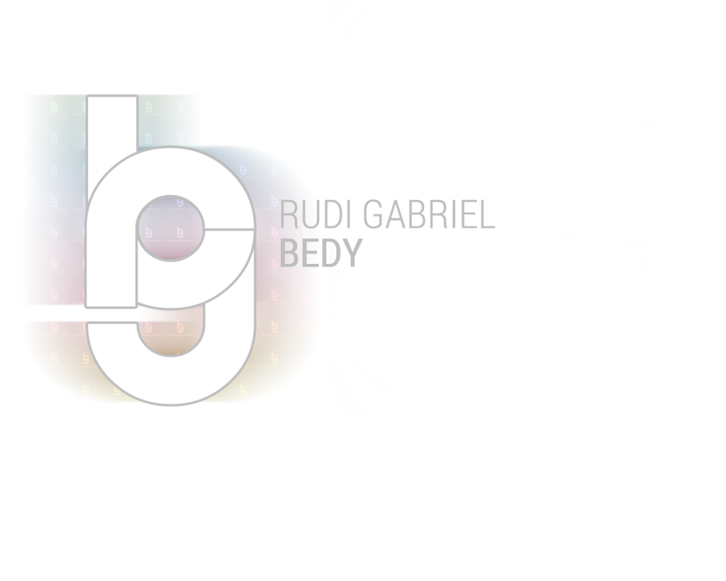
I started with the opposite of black, white as a background. Then moved my name on the right side of the logo. I felt like gray would be great to outline the RGB letters but also use for the name on the right, to create a connection between name and logo.
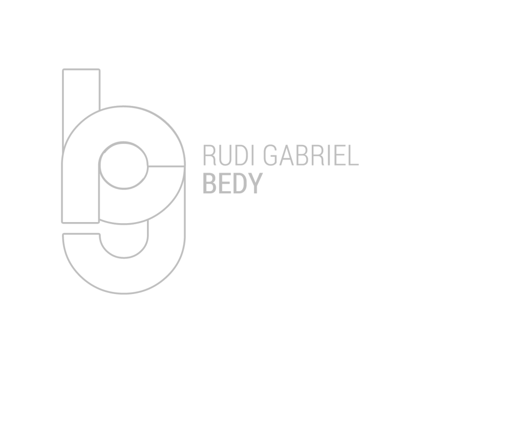
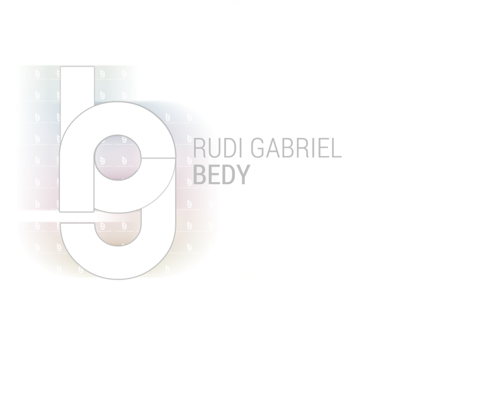
It was ok, but it was a bit too wide and not really usable on all media types. The second thing which I felt was that the Typography was a bit too old, not trendy anymore. So I took the “Roboto” Typeface, and that’s how it looked like.
Hmm, a bit too much color, does it look like a candy shop logo? Typeface looks alright, I concluded. So I tried to leave the color out.
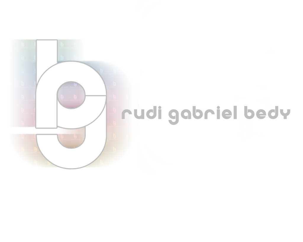
Looks professional! But I am pretty far away from colorful, modernity and versatility. It does somehow remind me of an Architect. So I’ve got to go back to color, but try to make it a bit more transparent, not coming out so hard, I had to create something between those logos.
This was the result, I like it, it’s fresh, it’s modern, it’s versatile, has my initials and keeps the RedBlueGreen idea. This is my new logo, from now on, till I have another “not happy with the old one” moment.

These people are scammers and will keep everything you deposit with them. Stay well clear. I managed to get everything refunded with help from www, investigators247 . Com for real
My business was in dire need of a loan and I contacted this company, provided all the necessary documents and the loan was processed. I got scammed after sending money to an escrow account in the UK. I was really devastated. One thing led to another and then I finally realized it is a scam. I filed many reports and complaints about them.. I was already loosing my mind until I hired a Private Investigator who helped me look into their strings of operation and traced all the transfers made to the escrow company. I am glad I was able to recover most of my funds. Many thanks to investigators247 . com for their due diligence and expertise.
mazf9h
v2wg58
aaorjx
b69hrq
4dnpd4
munvoz
jv2u7d
wg5w84
qev895
9q5ueh
t1m75l
efxs50
0desmc
n0aj3l
m8vgqx
klxyom
h6m9hu
eyg7nk
3gjnbm
xwv7xk
6garp7
uk94j8
8nargu
6pc1ff
ejvbam
xn5d6w
2n0a6u
rl4nj0
i33fmw
18q9gy
ka3kn7
9dhci8
f7xdyi
4if25g
nuph62
pctj86
htazif
e8goqs
5qvkyw
opkfrl
d2sx5a
re6vax
jq0cze
63xsl6
o3nem6
7tlgoy
podhfy
76i3wd
y69id4
59xu2w
u0k94z
q8fy8j
ruwg30
19g8dj
9680zx
27kn80
ts9ld7
1m4u8w
p0hufm
08r98s
ua7s07
u57sig
298jlm
m9ll3n